Web Design Services
Most of your visitors now land on your site from a phone or tablet. As Vinci Studio, we design fast, user-friendly websites that look flawless on every screen size, from desktop to mobile.
Platforms We Specialize In
Professional Web Design Services
Fast Load Times
A site that loads in seconds thanks to optimized code and modern infrastructure.
Mobile-Friendly Design
A single flexible design that looks flawless on phone, tablet, and desktop.
SEO-Ready Infrastructure
Meta tags, sitemap, and structured data are set up correctly from the start.
Premium UI/UX
A clean, user-friendly interface designed around your brand identity.
Secure Infrastructure
We keep your site safe with an SSL certificate and regular backups.
Easy Content Management
Update your own content without needing technical knowledge.
Our Web Design Process
Discovery and Analysis
We assess your business, target audience, and competitors together.
Design
We prepare an original design concept that reflects your brand identity.
Development
We turn the approved design into a fast, SEO-friendly website.
Testing and Launch
We test your site, launch it, and stay by your side afterward.
Our Projects in Web Design
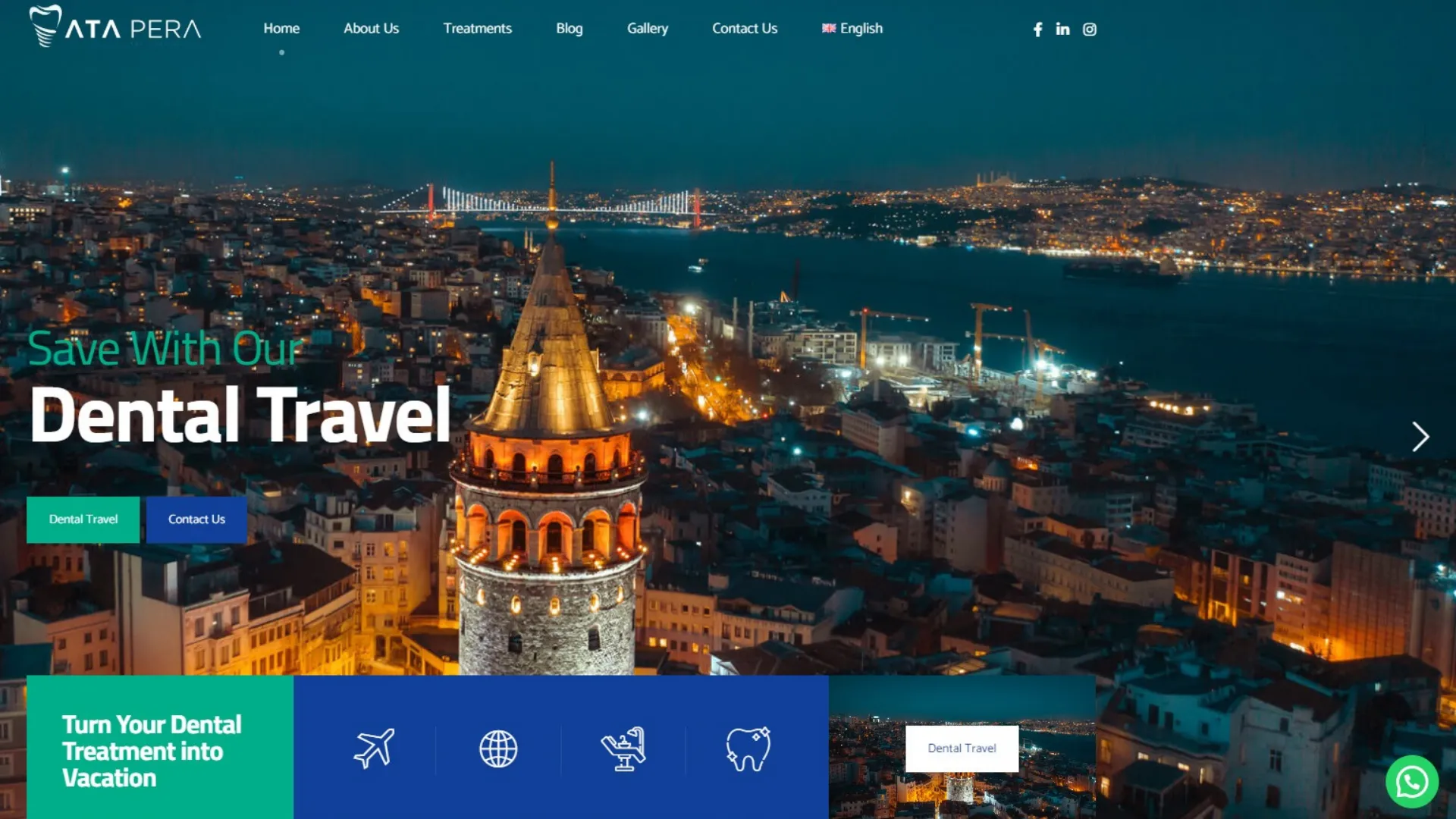
Ata Pera Dental
Pera'nın butik ruhunu yansıtan, randevu odaklı diş kliniği web sitesi.
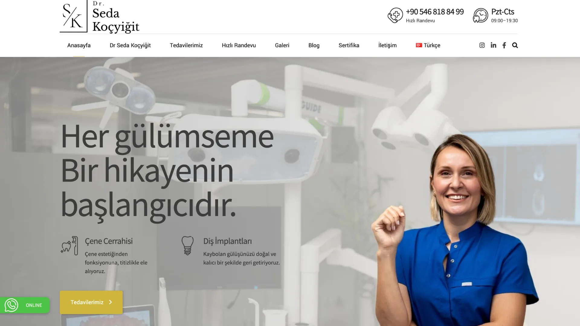
Dr. Seda Koçyiğit
Randevu odaklı, güven veren bir hekim tanıtım sitesi.
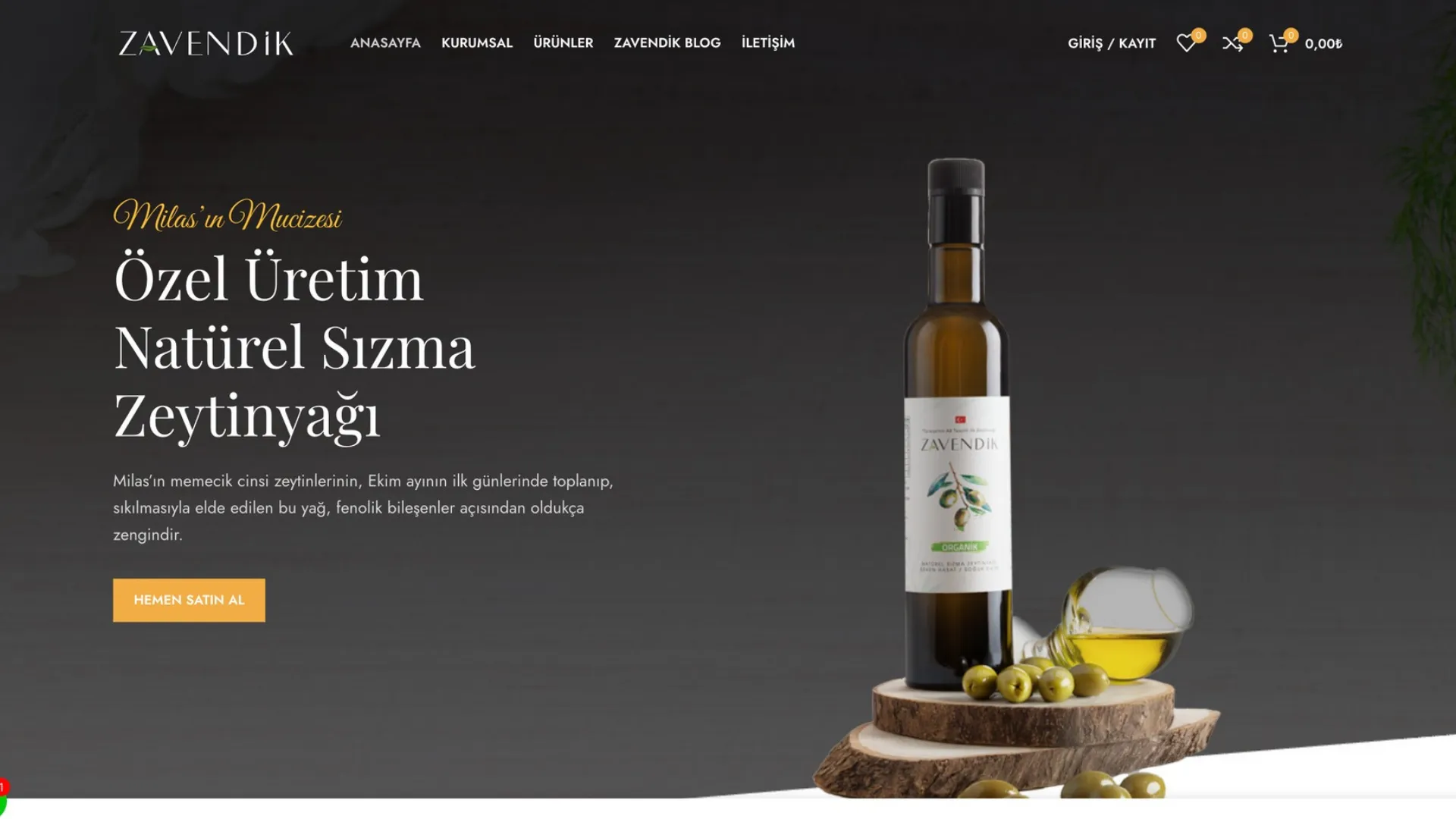
Zavendik Zeytinyağı
Doğal bir zeytinyağı markasının hikayesini anlatan kurumsal web sitesi.
Is Our Web Design Service Right for You?
Newly founded businesses looking for their first professional website
Brands whose current site is outdated, slow, or broken on mobile
Businesses wanting to strengthen their corporate identity online
Brands falling behind competitors in search engine rankings
Why Vinci Studio?
Custom Design, Never a Template
Every project is designed from scratch around your brand identity — you get a genuinely original result you won't find anywhere else online.
Transparent Pricing
No surprise costs; we set a clear price and scope at the quote stage and stick to that scope at every step of the project.
SEO Built In From Day One
We treat SEO as a natural part of the work, not a service tacked on afterward — the result is search-engine-ready from the start.
Deep Türkiye Market Knowledge
We know customer behavior and market dynamics across Türkiye's different regions closely, and bring that knowledge into every project.
Support After Delivery
Our job doesn't end at delivery — we build a long-term partnership through maintenance, updates, and technical support.
Real Sales Experience
We don't just aim for a visually pleasing result — we build a conversion-focused approach that turns visitors into customers.
The Right Web Design Package for Your Needs
Prices are starting points; we prepare a custom quote based on your project's scope.
Basic
₺30,000
starting price · one-time payment
- 5 Pages
- Custom Business Design
- Mobile-Friendly Design
- Admin Panel
- Domain (Paid/Annual)
- Hosting (Free First Year)
- SSL Certificate (Free)
- SEO-Ready Infrastructure
- Fast Load Times
- WhatsApp Support Integration
- Social Media Ready
- Monthly Backups
- Fast Hosting
- Phone Support
Pro
₺55,000
starting price · one-time payment
- 10 Pages
- Everything in Basic, plus:
- Blog / Content Management Module
- Advanced SEO Package
- Google Analytics & Search Console Setup
- Live Chat Integration
- Priority Technical Support
- 6 Months of Free Update Support
Enterprise
₺95,000
starting price · custom quote
- Unlimited Pages
- Everything in Pro, plus:
- Optional E-Commerce Module
- Custom Software Integrations
- Multi-Language Support
- Monthly Maintenance and Update Agreement
- Dedicated Project Manager
- 24/7 Priority Support
Get a rough estimate for Web Design
How many pages do you need?
Anything extra?
₺30,000 – ₺36,000
Everything About Web Design
A website is no longer just your brand's sole digital representative — it's often the first point of contact. If that first contact looks flawless on desktop but cluttered and slow on mobile, it shapes a visitor's impression of your brand negatively within the first few seconds. That's why in every project, we treat mobile responsiveness not as an afterthought, but as a principle at the center of our design philosophy from day one. Below, we've compiled every detail of our web design process along with the questions we hear most often.
What Is a Responsive (Mobile-Friendly) Website?
Responsive design is a design approach that lets a website automatically rearrange itself based on screen size. Whether a visitor lands on your site from a 27-inch desktop monitor or a 6-inch phone screen, the content, images, and navigation menu stay readable and usable at all times. This is made possible by flexible grid systems, scalable images, and CSS media queries working together in harmony.
All major search engines, Google included, favor pages built by teams that specialize in responsive design in their rankings. The reason is simple: a site with a poor user experience loses visitors within seconds, and that behavior gets read as a negative signal by search algorithms too.
The old alternative to responsive design — a separate 'mobile site' (m.yoursite.com) — has largely been abandoned today. Managing two separate sites leads to content inconsistency, extra maintenance cost, and messy SEO redirect issues. A single responsive site is a far healthier path, both for management and for search engine optimization.
- A single codebase delivering a consistent look across every device
- Full compliance with Google's mobile-first indexing criteria
- Lower bounce rates, higher conversion rates
- Easier maintenance and updates from a single content source
Did you know?
A significant share of visitors now reach websites from mobile devices. A non-responsive site risks losing a large portion of your potential customers within the very first seconds.
Why Is It a Critical Investment for Your Business?
A website is no longer just a digital business card — it's your brand's sales representative, working 24/7. A site that isn't responsive, loads slowly, or looks broken on mobile shakes a visitor's trust at first impression and sends them straight to your competitors. Especially in service industries, a large share of users complete the final step of their decision-making process on their phone; the smallest friction at that step means a lost customer.
As a corporate web design agency, we always ask our clients the same question: 'What does your competitor's site look like on a phone?' More often than not, that question alone is motivation enough to make a difference — because many businesses only ever test their website on desktop and overlook just how important the mobile experience really is.
Investing in a responsive website isn't a one-time cost; it's a long-term brand credibility and customer acquisition strategy. A well-built responsive site directly boosts the return on the rest of your marketing budget (ads, SEO, social media) too, because it properly receives the traffic coming in from all those channels.
Brand Credibility
A professional, consistent look builds trust with every visitor.
SEO Performance
Google ranks mobile-friendly sites higher in search results.
Higher Conversion
An easy-to-navigate site turns more visitors into customers.
Custom Web Development and UI/UX Design
No two brands fit the same mold. That's why we don't stop at off-the-shelf templates — for businesses that need it, we offer custom web development and UI/UX design. Complex workflows, custom integrations, or a truly unique user experience call for software built from scratch. Needs like booking systems, custom pricing engines, third-party API integrations, or complex form flows are exactly the kind of projects that push past what an out-of-the-box CMS can handle.
Our UI/UX process moves through user research, information architecture, wireframes, and high-fidelity prototypes. Our goal isn't just a good-looking interface — it's one that gets the user to their goal without friction. We design every screen with the user's mindset and intent in that exact moment in mind.
On custom software projects, our design and development teams work in lockstep. The moment a designer finishes a screen, a developer immediately assesses its technical feasibility — this tight collaboration greatly reduces the risk of surprises that need reworking later.
- A design process that starts with user research and competitor analysis
- Interactive prototyping in Figma with stakeholder sign-off
- High-performance builds with modern frameworks (Next.js, React)
- Integration with third-party systems (CRM, payment infrastructure, ERP)
Our Technical Approach: Speed and Accessibility
Responsive design isn't just a visual matter — it's a technical discipline too. With flexible grid systems, optimized images, and smart breakpoint strategies, we make sure your site is fast and accessible on every device. Serving images at different resolutions based on device size (responsive images) prevents unnecessary data downloads and guarantees a fast experience for mobile users too.
We also build interfaces that reach a broad audience, including users with disabilities, by keeping accessibility standards in mind throughout. Keyboard navigation, screen reader compatibility, and sufficient color contrast are a standard part of our design process — an investment that pays off both ethically and in SEO terms, since search engines treat accessible sites as a positive signal too.
From Design to Launch: Our Process
Every web design project moves through four stages: discovery and analysis, wireframing and UI design, development, multi-device testing, and launch. Before launch, we test your site across dozens of different screen sizes to root out potential issues at the source.
Throughout the process we hold regular demo meetings with you, carrying your feedback into the next stage. This approach prevents you from being surprised by the final result and ensures the end product is shaped in line with your brand's vision from the very start.
- Discovery and Analysis: We understand your goals and your target audience
- UI/UX Design: We shape the design together in Figma
- Development and Testing: We build it and test it on dozens of devices
- Launch and Support: Your site goes live, technical support continues
Standing Out Through Competitor Analysis
Before designing a new website, we study the digital presence of the competitors in your industry. This analysis clarifies which design patterns have become the standard in your sector, and where you can differentiate to stand out.
Our goal isn't to copy your competitors — it's to spot what they've left out and make your brand's real difference visible in the digital space too. This strategic lens ensures design decisions rest on a competitive foundation, not just aesthetics.
Common Mistakes and How to Avoid Them
One of the most common mistakes we see in responsive design is testing a site on only one or two standard screen sizes. In reality, dozens of different phone and tablet models are in use, each with its own resolution and aspect ratio. A site tested only on the most common devices can look broken for a smaller — but still significant — chunk of users.
Another common mistake is simply shrinking elements designed for desktop as-is. Real responsive design requires rethinking the priority order on small screens; deliberate decisions have to be made about what information sits at the top and which action is most visible on mobile. Skipping this step makes it harder for mobile visitors to find what they're looking for, and they leave the site.
Responsive Design Integrated With a Content Management System
When designing a responsive website, the site needs to keep looking right not just at the moment it launches, but as you add content and create new pages over time. That's why we account for the content management system you'll use (an off-the-shelf CMS or a custom panel) from the start, building components that are flexible and compatible with that system.
For example, a long image you add to a blog post or an extra block of text you add to a product page should automatically comply with responsive rules without breaking the site's overall layout. Getting this flexibility right from the start significantly reduces the number of technical surprises you'll run into when updating your site in the years ahead, and lets your content team work comfortably without needing a designer on hand.
Why Responsive Design Matters for E-Commerce
A large share of online shoppers now complete the add-to-cart and checkout steps on their phones too. That's why responsive design in an e-commerce site isn't limited to product images looking right — details like the checkout form being easy to fill out on mobile, filter menus staying usable on a small screen, and cart steps being completable with minimal taps directly affect your sales rate.
The smallest friction in the mobile checkout flow (a tiny button, a form field that's hard to read) can cause a user to abandon their cart. That's why in e-commerce projects we separately test the mobile checkout experience and validate it against real user scenarios.
Frequently Asked Questions
A responsive website is a single site that works on every device through a browser. A mobile app is device-specific software downloaded from the App Store or Google Play. For most businesses, a responsive website reaches a wider audience at a lower cost.
Let's Talk About Your Web Design Project
Tell us what you need and we'll prepare a custom roadmap and quote for you.